
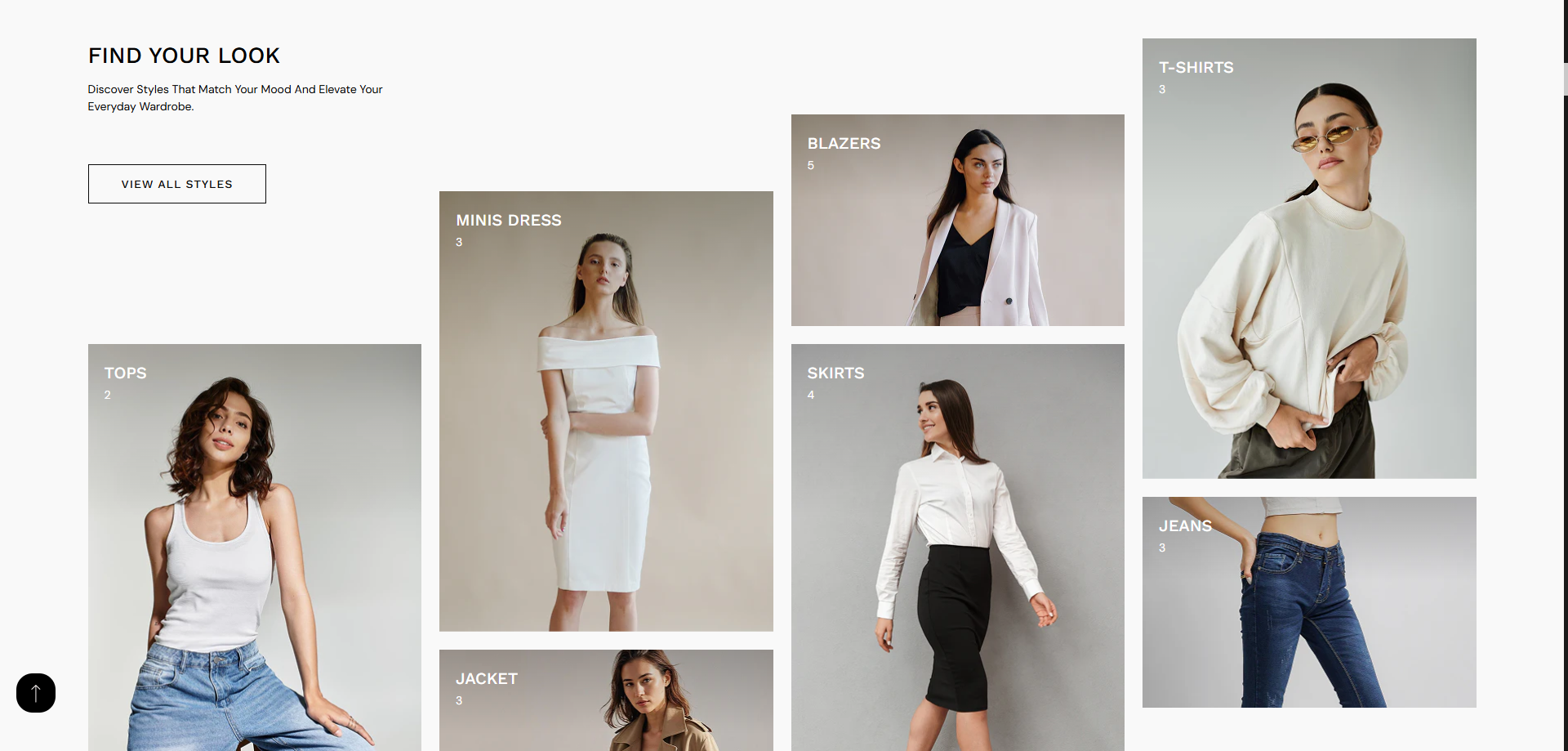
Collection Grid (Style 2)
The Collection Grid (Style 2) allows you to display multiple collections in a visually engaging, masonry-style layout. This section is designed to highlight different categories with custom images, titles, and product counts, helping customers quickly explore your store.
With a mix of large and small image blocks, this layout creates a modern and dynamic shopping experience. It is ideal for showcasing featured categories like Tops, Dresses, Jackets, and more in an attractive grid.
How To Add the Collection Grid
- Login to your Shopify Theme Customizer.
- Navigate to the page where you want to add this section.
- Click on the Add section button.
- Select Collection Grid style2 from the list.
How To Edit the Collection Grid
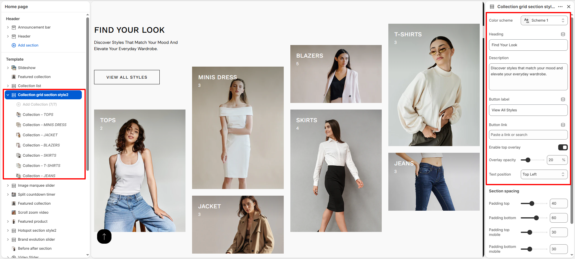
- Color Scheme: Select a color scheme to control the overall appearance of the section, including background and text colors.
- Heading: Add a main title (e.g., Find Your Look) to introduce the section.
- Description: Provide a short description to give context or highlight your collections.
- Button Label: Set the text for the call-to-action button (e.g., View All Styles).
- Button Link: Add a link to redirect users when they click the button.
- Enable Top Overlay: Enable this option to apply a dark overlay on collection images for better text visibility.
- Overlay Opacity: Adjust the transparency level of the overlay.
- Text Position: Choose where the text appears on the image (e.g., Top Left).
- Section Spacing: Control the padding (top and bottom) for desktop and mobile devices.
Configure Collection Blocks
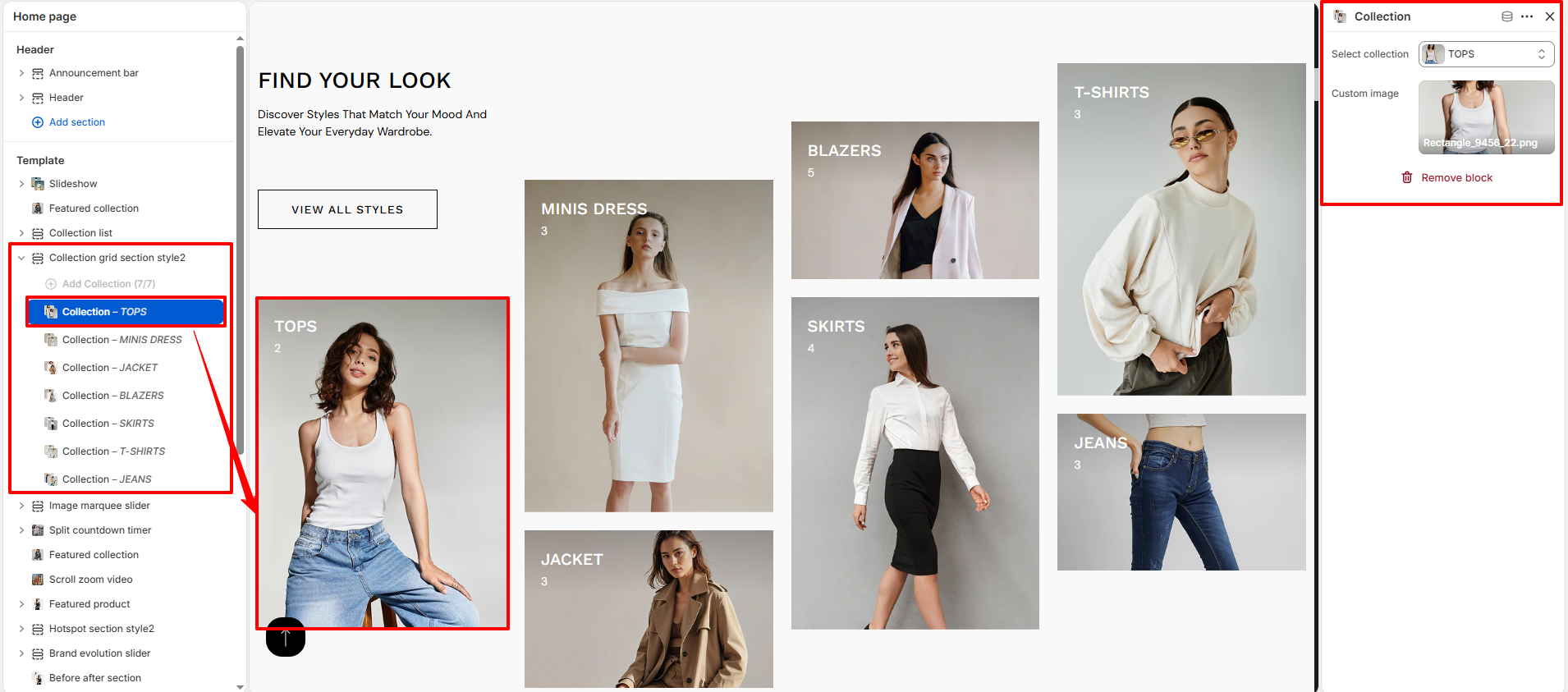
- Add Collection Blocks: Click Add Collection to include multiple collection items.
- Select Collection: Choose a collection (e.g., Tops, Minis Dress, Jacket).
- Custom Image: Upload a custom image to override the default collection image.
- Remove Block: Delete any collection block if not needed.
- Reorder Blocks: Drag and arrange blocks to control layout positioning.