
Products Hotspot
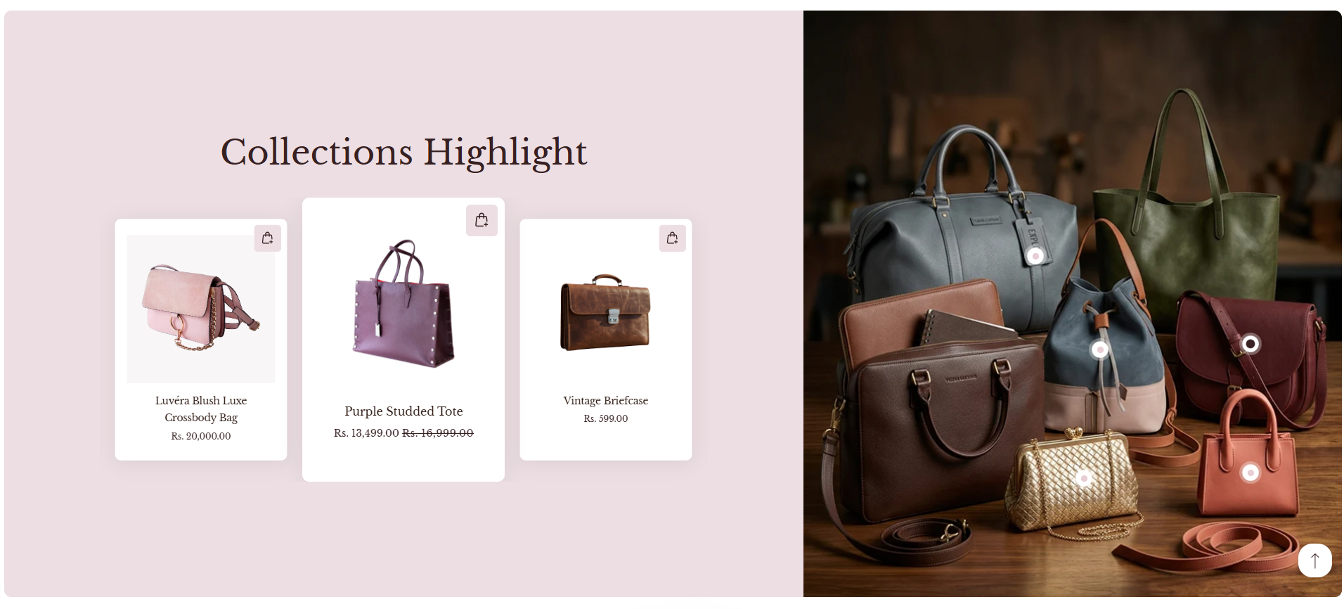
The Products Hotspot section allows you to turn a single image into an interactive shopping experience by placing clickable product points directly on it. Customers can explore featured items visually and jump straight to product pages with just one click, making discovery quick and intuitive. This section is ideal for showcasing complete looks, lifestyle imagery, or curated collections in a modern and engaging way.
How To Add the Products Hotspot section
- Go to your Customizer and navigate to the page you would like to display this section.
- You'll see a list of available sections on the left-hand side. Locate the Add section button and click on it.
- From the list of available sections, find and select Products Hotspot.
How To Edit the Products Hotspot section
Here are the steps to configure the options mentioned for the Products Hotspot section in your Dynamic Shopify theme:
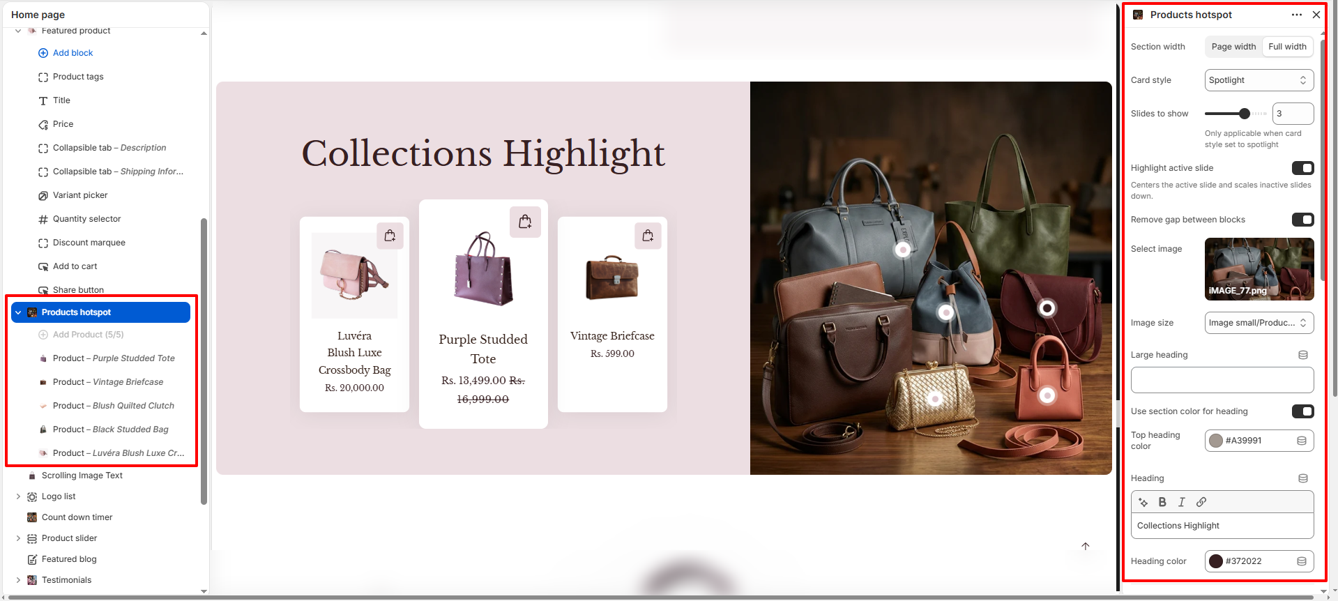
- Section Width: Choose between Page width or Full width to control how wide the section spans across the page.
-
Card Style: Select the card display style from the dropdown.This controls
how product cards are visually presented.
- Normal
- Stacked
- Spotlight
- Slides to Show: Set the number of product slides visible at a time (e.g., 3). This setting is only applicable when the card style is set to Spotlight.
- Highlight Active Slide: Toggle this option to center the active slide and scale down inactive slides, drawing attention to the featured product.
- Remove Gap Between Blocks: Toggle this to remove spacing between the left and right content blocks for a seamless layout.
-
Select Image:
- Click Upload images to add the main image where product hotspots will appear.
- This image acts as the visual base for placing interactive product points.
- Image Size: Choose the image display size from the dropdown (e.g., Image small/Product). This controls how the hotspot image is rendered.
- Large Heading: Enter a bold introductory line (e.g., "Glowing Beauty in") to grab attention.
- Use Section Color for Heading: Toggle this to use the section's color scheme for the heading text automatically.
- Top Heading Color: Set the color for the top heading text (e.g., #A39991).
- Heading: Add the main title text (e.g., "Collections Highlight") to describe the showcased look or theme. Supports rich text formatting (Bold, Italic, Underline, Link).
- Heading Color: Set the color for the heading text (e.g., #372022).
- Slide Background Color: Set the background color for the overall hotspot slide area (e.g., #FFFFFF).
- Slide Text Color: Define the text color used inside the slide content area (e.g., #331F17).
- Right Block Background Color: Choose the background color for the right content block (e.g., #928071).
- Left Block Background Color: Set the background color for the left content block (e.g., #EC0EE2).
- Hotspot Pointer Background Color: Set the background color for the hotspot pointer dots (e.g., #FFFFFF).
- Hotspot Pointer Highlight Color: Choose the highlight color for the hotspot pointer on hover or focus (e.g., #D0C4CB).
- Hotspot Active Pointer Color: Define the color of the active (selected) hotspot pointer (e.g., #372022).
- Border Radius: Adjust the corner roundness applied to images, columns, and product cards (e.g., 10px) for a softer, modern appearance.
- Image Ratio: Select the aspect ratio for product card images from the dropdown (e.g., Square). This ensures visual consistency across all product cards.
- Padding Top: Adjust the space above the section (e.g., 0).
- Padding Right: Adjust the space to the right of the section (e.g., 0).
- Padding Left: Adjust the space to the left of the section (e.g., 0).
- Padding Bottom: Adjust the space below the section (e.g., 0).
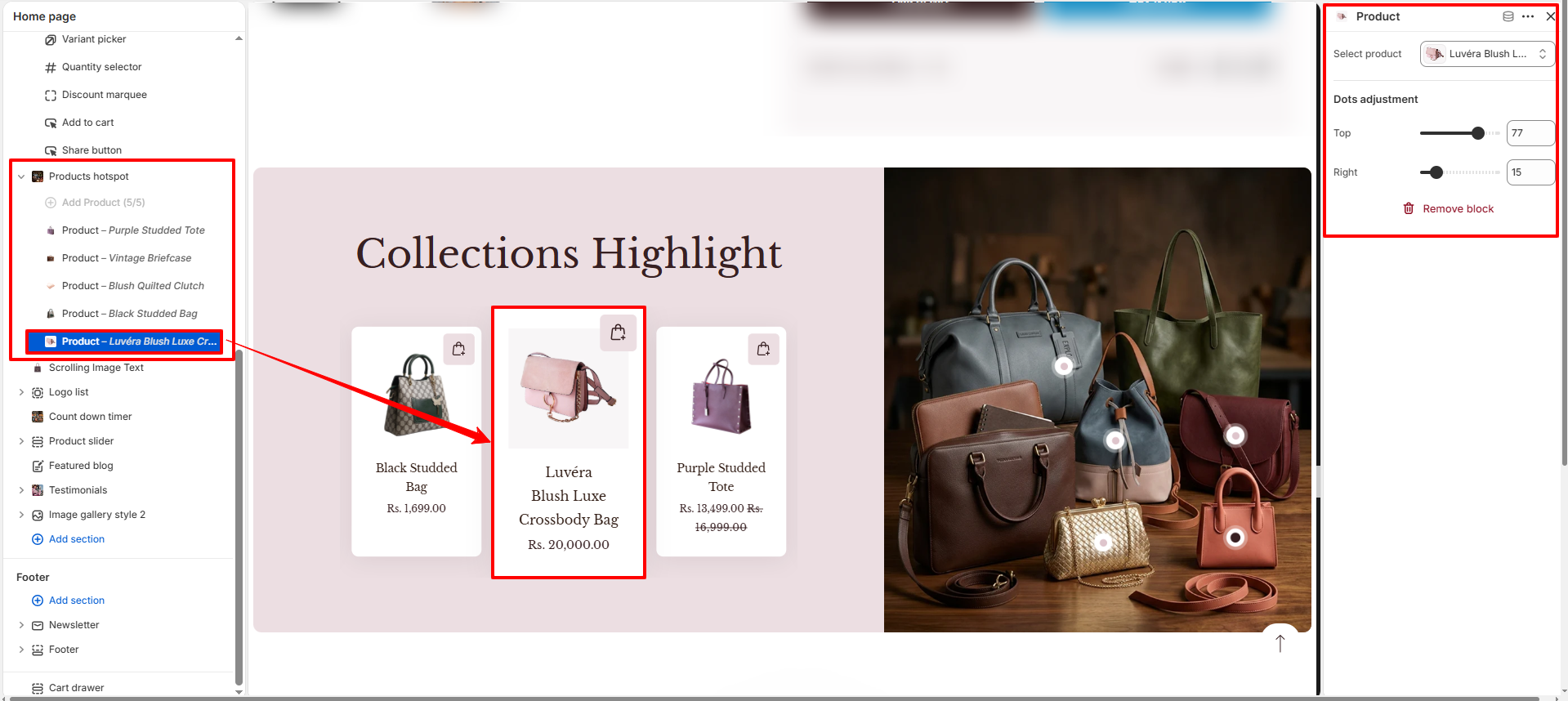
Configure the Hotspot Block Settings
- Select Product: Choose the product that will be linked to this hotspot. When customers click the hotspot, they will be directed to the selected product page.
- Hotspot Position: Adjust the hotspot placement by setting the X (horizontal) and Y (vertical) values. This helps you precisely position the hotspot over the desired area of the image on desktop screens.