
Tabs Collection
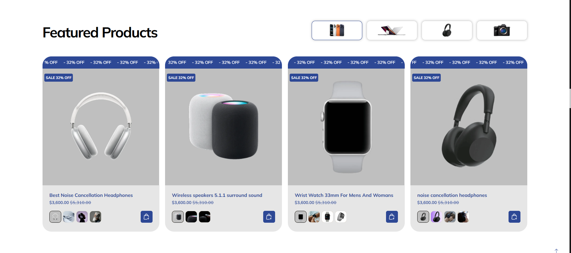
The Tabs Collection section allows you to organize multiple collections into an interactive tabbed layout. Users can switch between different collections using a top tab bar, which can feature custom icons or images for each collection. This section is ideal for categories like "Featured Products", "New Arrivals", or "Best Sellers" in one compact area.
Adding the Tabs Collection section
- Open the Customizer and go to the page where you want to add the "Tabs collection" section.
- On the left-hand side, click the "Add section" button.
- From the available options, choose "Tabs collection" to add it to your page.
How To Configure Tabs Collection section
Steps for Configuring the "Tabs collection" Section in the Dynamic Theme
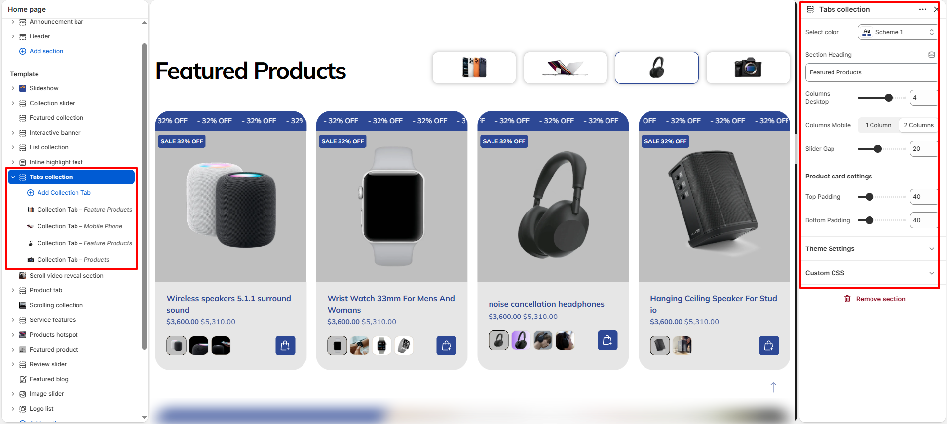
- Select color: Choose a predefined color scheme for the section.
- Section Heading: Set the main title for the section (e.g., "Featured Products").
- Columns Desktop: Set the number of columns to display on desktop screens (e.g., 4).
- Columns Mobile: Choose between "1 Column" or "2 Columns" for mobile view.
- Slider Gap: Adjust the spacing between product cards in the grid.
- Product card settings:
- Top Padding / Bottom Padding: Set the internal vertical spacing within the product cards.
How To Configure Collection Tab (Blocks):
Each block represents a single tab in the collection navigation.
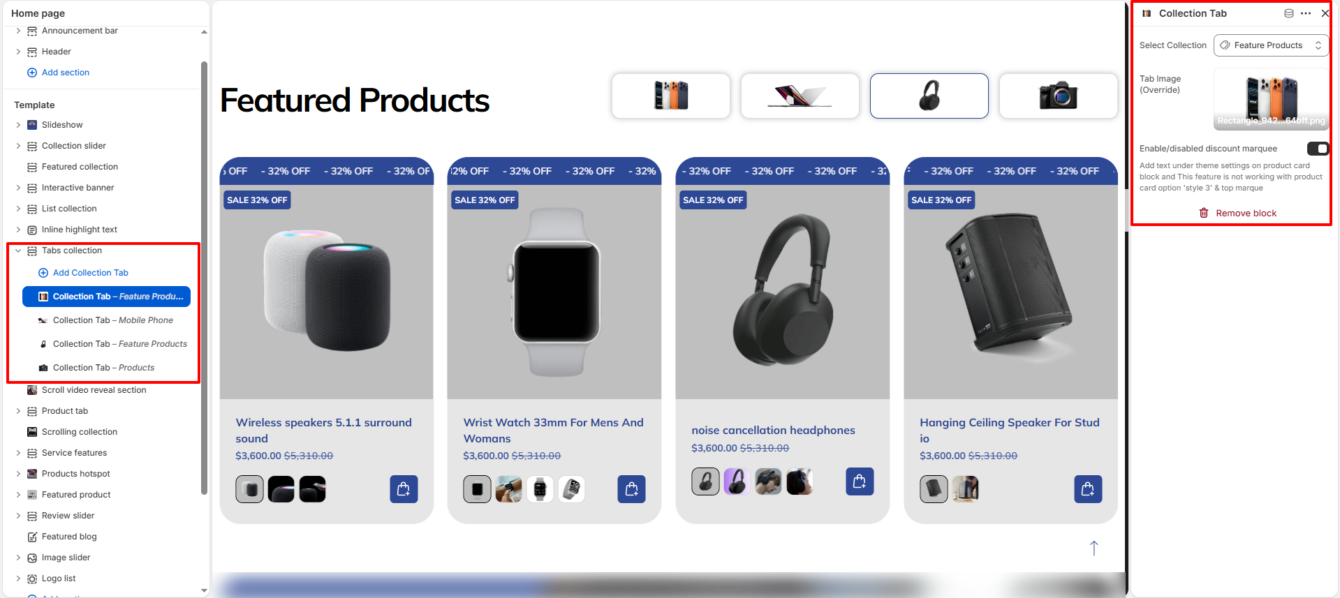
- Select Collection: Choose the Shopify collection to be featured in this tab.
- Tab Image (Override): Upload a custom icon or image to represent the collection in the tab bar.
- Enable/disabled discount marquee: Toggle a scrolling marquee overlay on products within this tab.