
Header section
The Header in the Dynamic theme plays a vital role in shaping your store's first impression and guiding customers through your site with ease. It acts as the primary navigation hub, helping shoppers quickly find products, collections, and key pages while reinforcing your brand identity.
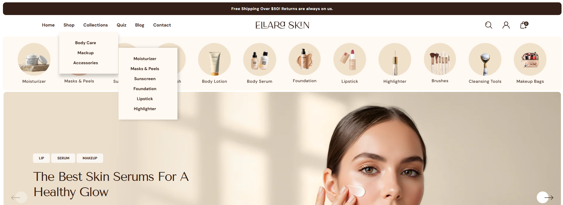
Dynamic offers flexible header layouts with a refined, modern design, featuring intuitive icons for search, account, and cart access. Built-in support for dropdown and mega menus allows you to organize large catalogs effortlessly, while options like sticky, transparent, or solid headers ensure smooth navigation as customers scroll. Together, these features create a seamless, polished browsing experience across all devices.
How to Configure the Header section
- From your Shopify admin, go to Online Store ? Themes.
- Click Customize on the Dynamic theme.
- In the Theme Editor, select the Header section from the left panel.
- Adjust the settings, blocks, and layout options according to your preferences.
- Click Save to apply and publish your header changes.
How to Configure the Header section Settings
- Select Color: Choose a predefined color scheme for the header background and text.
-
Settings (General):
- Enable Sticky Header: Keep the header fixed at the top while customers scroll.
- Enable Header Overlay (Home Page): Makes the header transparent and overlays it on top of the home page content/slideshow.
-
Logo:
- Select Logo: Upload your store's primary logo image.
- Logo Width: Adjust the slider to set the desired width of your logo.
- Logo Position: Choose how your logo and menu are arranged. Options include Logo Left, Logo Center, Drawer, and Logo Left Menu Bottom.
-
Menu:
- Select Menu: Choose the main navigation menu for your header.
- Text Display: Choose between "Default" or "Uppercase" for the menu links.
-
Announcement Bar:
- Enable Announcement Bar: Toggle the visibility of the top announcement strip.
- Announcement Text: Enter the message you want to display to customers.
- Announcement Background: Select the background color for the bar.
- Announcement Text Color: Select the color for the text inside the bar.
-
Menu Drawer Color Setting:
Note: These settings apply when you select the 'Drawer' or 'Logo Left Menu Bottom' logo position.
- Menu Primary Label/Background Color: Set the appearance of the top-level drawer items.
- Child Menu Label/Background Color: Customize the appearance of nested menu items.
- Menu Bottom Label/Background Color: Set colors for the bottom actions (account, contact, etc.) in the drawer.
- Header Border Radius: Adjust the corner roundness of the header elements.
-
Account Setting:
- Account Type: Choose the display format for the account link (e.g., Account Page).
-
Search Block Setting:
Note: This setting works only when the Logo Position is set to 'Logo Left Menu Bottom'.
- Drop down button text: Enter text for the category dropdown (e.g., "COLLECTIONS").
- Drop down menu: Choose the menu to display within the search categories.
- Search text: Enter multiple comma-separated phrases for the animated placeholder effect.
-
Section Spacing:
- Top / Bottom Spacing: Adjust vertical internal spacing for the header.
- Margin Left-Right Spacing: Adjust the side margins of the header content.
FAQs
How can I set up my navigation and mega menu?
Setting up your navigation and mega menu is a breeze! Check out our comprehensive Mega Menu Guide for detailed, step-by-step instructions to create a visually stunning and functional menu layout.
Can I display the menu as a drawer for desktop?
Yes, you can enable a drawer-style menu on desktop. Go to the Header section settings and select Drawer from the Logo Position dropdown.
Why isn't my mega menu displaying an image?
You need to make sure an image is properly added inside the mega menu block.