Dynamic Theme Settings
Dynamic empowers you with flexible and intuitive customization options, allowing you to shape your store exactly the way you envision—without writing a single line of code. From colors and typography to layouts and visual details, everything can be adjusted directly within Shopify's easy-to-use theme editor. These settings help ensure your storefront stays visually consistent, modern, and perfectly aligned with your brand identity.
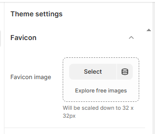
1. Favicon
A favicon is the small icon that appears in the browser tab next to your store name. Adding a custom favicon helps reinforce your brand identity and makes your store easy to recognize across tabs, bookmarks, and browser history.
How to Add a Favicon
- From your Shopify admin, go to Online Store ? Themes.
- Click Customize on the Dynamic theme.
- In the Theme Editor, open Theme Settings from the bottom-left corner.
- Select the Favicon option.
- Under Favicon Image, click Upload images or choose an existing image.
- You may also use Explore free images to select from Shopify's image library.
- The uploaded image will automatically be scaled down to 32 × 32 pixels.
- For best performance, keep the file size lightweight.
2. Layout
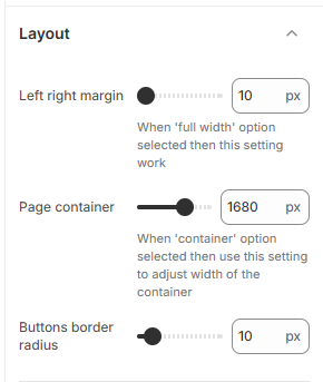
The Dynamic theme includes flexible layout controls that help define the overall structure and spacing of your store. These settings allow you to fine-tune page width, margins, and button styling to create a clean, well-balanced design across all screen sizes.
Layout Options
-
Left & Right Margin:
Adjust the horizontal spacing on both sides of the page.
Note: This setting applies only when the section layout is set to Full Width. -
Page Container Width:
Define the maximum width of the content area (e.g., 1680px).
Note: This option works when the layout is set to Container. - Buttons Border Radius: Control how rounded the buttons appear across the theme, helping you achieve either a sharp or soft visual style.
How to Adjust Layout Settings
- From your Shopify admin, go to Online Store ? Themes.
- Click Customize on the Dynamic theme.
- In the Theme Editor, open Theme Settings.
- Select Layout to access margin, container width, and button styling options.
- Adjust the values according to your design needs and click Save.
3. Section Heading Settings
-
Section Heading Overlay:
Enable this option to display large overlay text behind the main section heading.
When disabled, the overlay text appears above the section title instead. - Heading Font Size: Set the font size of the primary section heading (e.g., 40px).
- Section Heading Color: Choose the color for the main section heading text (e.g., #331F17).
- Sub Heading Overlay Font Size: Adjust the size of the overlay heading text displayed behind the section title (e.g., 80px).
- Overlay Heading Color: Define the color used for the overlay text (e.g., #EFEDEC).
-
Sub Heading Size:
Set the font size of the subheading text (e.g., 34px).
Note: This font size applies only when the Section Heading Overlay option is disabled.
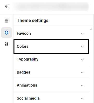
4. Colors
The Dynamic theme includes a flexible color system based on color schemes. Each scheme groups related colors and applies them consistently across your store's sections and components. You can create multiple schemes and assign them to different sections or blocks to maintain a cohesive and polished design.
What is a Color Scheme?
A color scheme is a predefined set of colors that you configure once and reuse throughout your theme. Instead of adjusting colors for each section individually, you simply apply a scheme. This automatically controls backgrounds, text, buttons, and other visual elements. Learn more about Shopify's color schemes here .
- From your Shopify admin, go to Online Store ? Themes.
- Click Customize on the Dynamic theme.
- In the Theme Editor, open Theme Settings (bottom-left corner).
- Select the Colors option.
5. Customizing Dynamic Default Theme Content
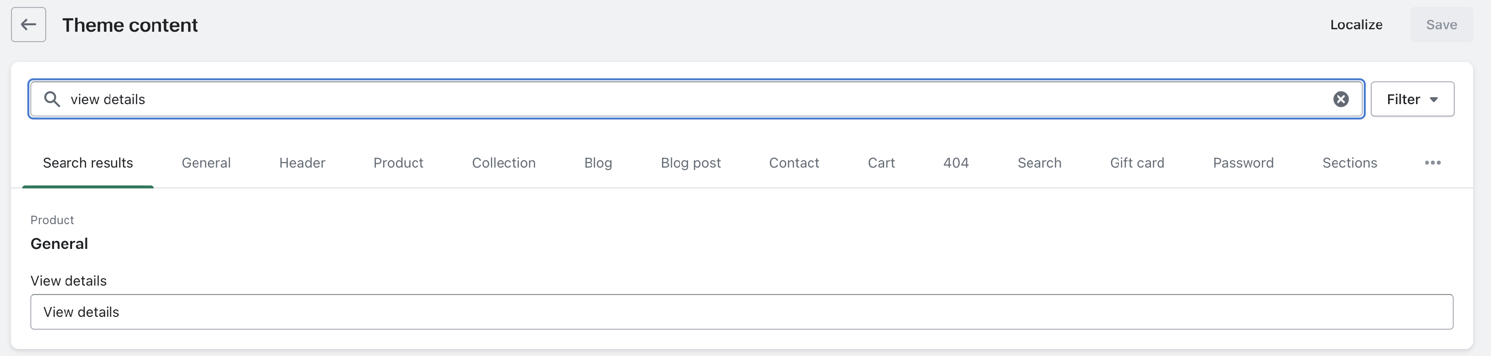
The Dynamic theme comes with built-in translations for multiple languages. You can easily customize the default text to better match your brand tone and messaging.
To update the content, go to your theme list and locate Dynamic. Click the More actions button (three dots) and select Edit default theme content.
This will open a list of all predefined text used throughout the theme. Use the Filter search field to find specific text by typing a few keywords, then update the wording as needed.
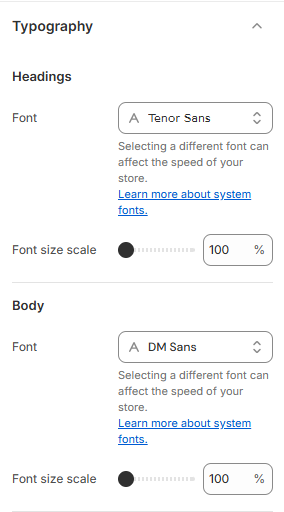
6. Typography
The Dynamic theme offers flexible typography controls that let you define how text appears across your entire store. You can choose different fonts for headings, body text, and additional accents to create a polished, consistent look that aligns with your brand identity. All font changes are applied globally, ensuring a clean and professional appearance throughout the site.
Typography Settings
-
Headings Font:
Select the font used for all headings (e.g., Tenor Sans).
Font Size Scale: Adjust the overall size of heading text (e.g., 100%). -
Body Font:
Choose the font for paragraphs and general content (e.g., DM Sans).
Font Size Scale: Control the readability of body text across the store. - Additional Font: Assign an optional accent font (e.g., Playfair Display) for decorative or highlighted text elements.
- Note: Selecting different fonts may impact store performance. Shopify's optimized font loading helps balance design and speed.
How to Customize Typography
- From your Shopify admin, go to Online Store ? Themes.
- Click Customize on the Dynamic theme.
- Open Theme Settings in the Theme Editor.
- Select Typography to adjust fonts and font size scales.
- Click Save to apply your changes.
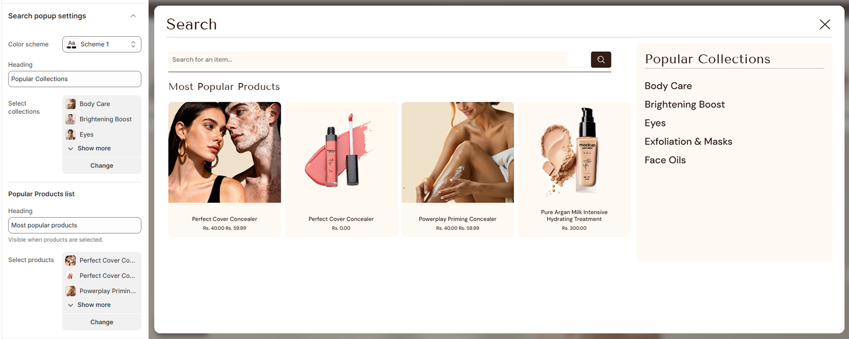
7. Search Popup
The Dynamic theme includes a modern Search Popup that appears when customers click the search icon. This popup helps shoppers discover products faster by showcasing popular collections and featured products directly within the search experience, without leaving the current page.
- From your Shopify admin, go to Online Store ? Themes.
- Click Customize on the Dynamic theme.
- In the Theme Editor, open Theme Settings and select Search Popup.
- Color Scheme: Choose a color scheme to style the search popup background and text.
-
Popular Collections:
- Enter a heading (e.g., “Popular Collections”).
- Select collections to display inside the search popup.
-
Popular Products List:
- Add a heading (e.g., “Most Popular Products”).
- Select products to feature in the popup.
- Note: This section appears only when products are selected.
- Click Save to apply your changes.
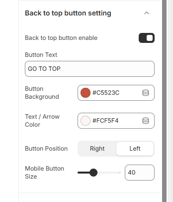
8. Back to Top Button
The Back to Top Button feature allows you to add a convenient button that helps users quickly scroll back to the top of the page. This improves navigation, especially on long pages, enhancing the overall user experience.
How to Configure the Back to Top Button?
You can easily enable and customize the button's appearance and position from the theme settings. Adjust colors, text, and size to match your store's design.
- From your Shopify admin, go to Online Store ? Themes.
- Click Customize on your active theme.
- In the Theme Editor, open Theme Settings.
- Select Back to Top Button.
- Enable the Back to Top Button toggle.
- Update the Button Text (e.g., "GO TO TOP").
- Choose the Button Background color.
- Set the Text / Arrow Color.
- Select the Button Position (Right or Left).
- Adjust the Mobile Button Size using the slider.
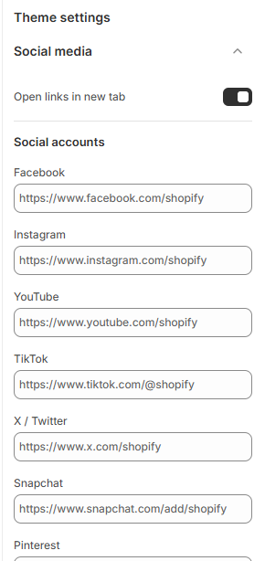
9. Social Media
The Dynamic theme makes it easy to connect your store with popular social media platforms, helping customers follow, share, and engage with your brand. Social media icons can appear across key areas of your store, including the header, footer, and other social-enabled sections.
How to Manage Social Media Links
- From your Shopify admin, go to Online Store ? Themes.
- Click Customize on the Dynamic theme.
- In the Theme Editor, open Theme Settings ? Social Media.
- Enter the full URLs of your social media profiles for each platform.
- Click Save to apply the changes across your store.
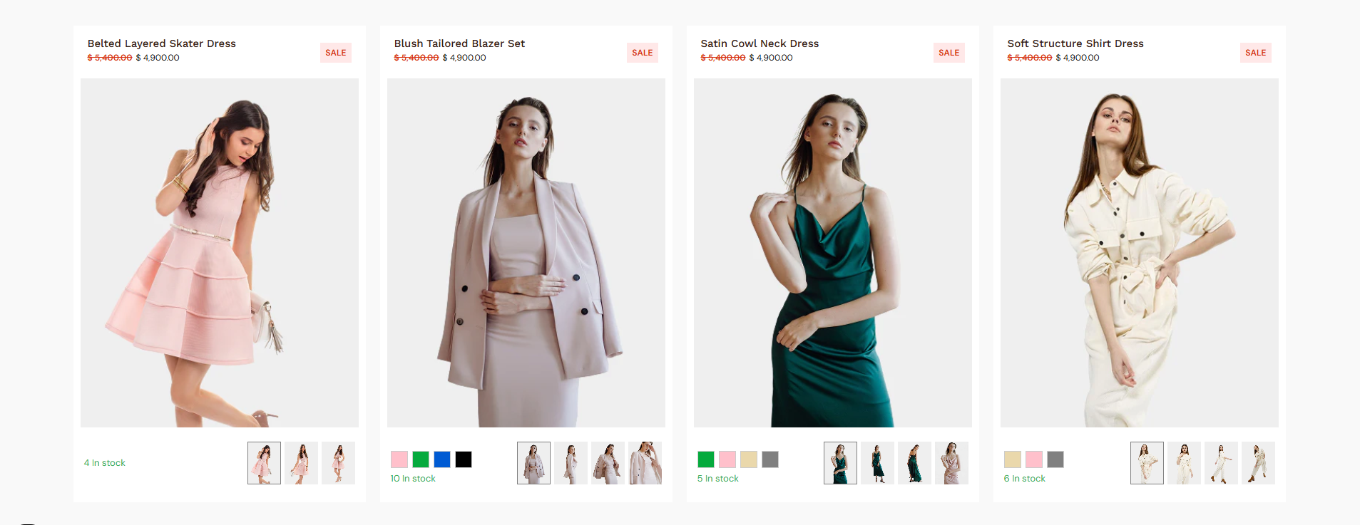
7. Product Card Settings
The Product Card Settings section allows you to fully customize how product cards appear across your store. You can control layout styles, colors, badges, interactive elements, and additional features like discount marquees and quick view options to enhance user experience and product visibility.
How to Access Product Card Settings?
- From your Shopify admin, go to Online Store ? Themes.
- Click Customize on your active theme.
- In the Theme Editor, open Theme Settings.
- Select Product Card.
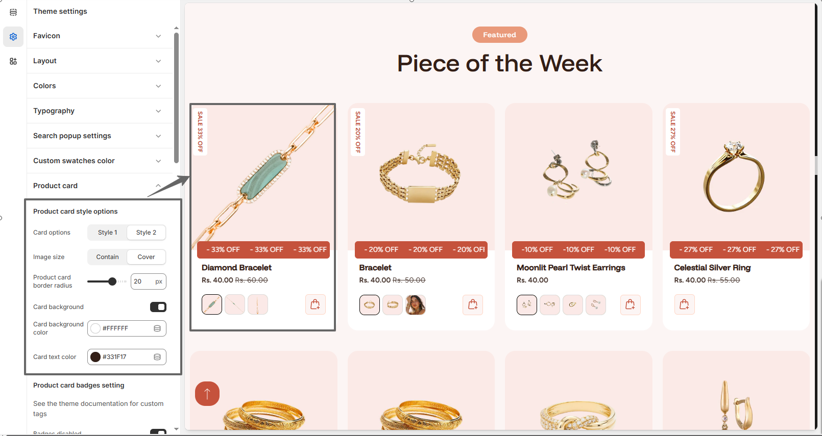
Product Card Style Options
- There are three product card styles available in the theme (Style 1, Style 2, and Style
3). Select the one that best fits your needs.
Product Card Style 1
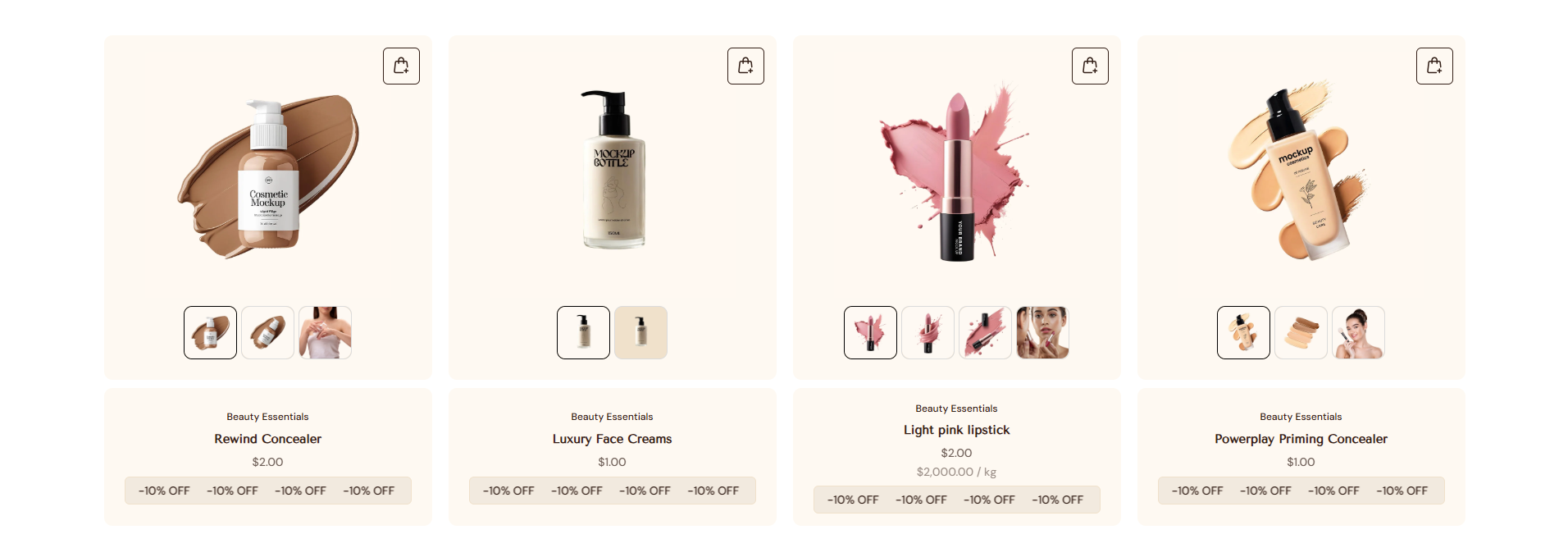
Product Card Style 2
Product Card Style 3
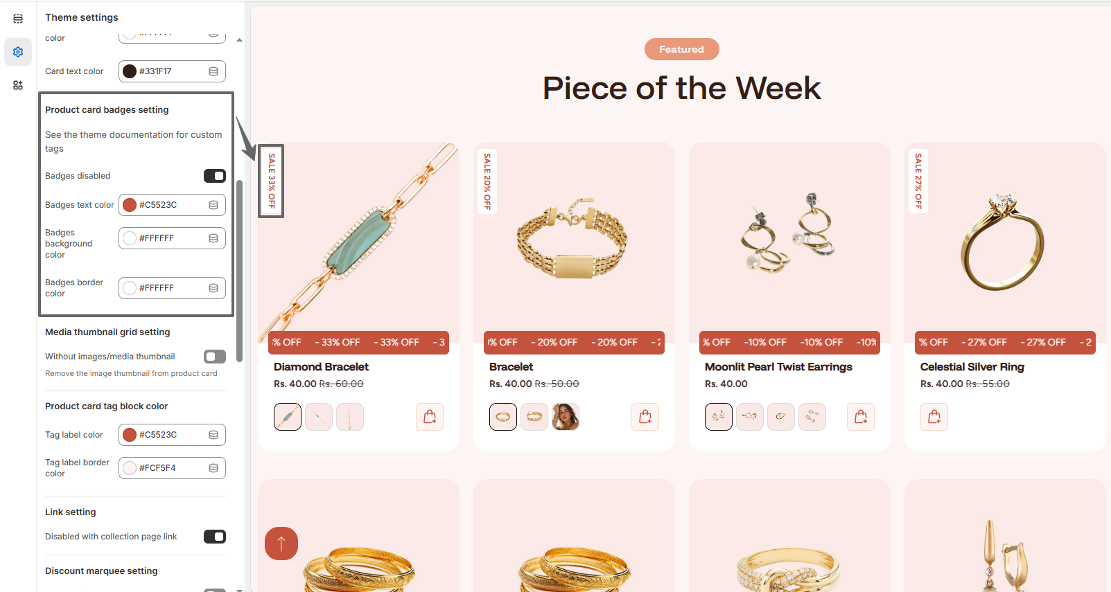
Product Card Badges Setting
Badges help highlight important product information such as discounts, new arrivals, or custom tags.
- Enable or disable Badges.
- Set Badges Text Color.
- Choose Badges Background Color.
- Adjust Badges Border Color.
Media Thumbnail Grid Setting
- Enable or disable Media Thumbnail Grid.
- Disable to remove thumbnails from product cards for a cleaner layout.
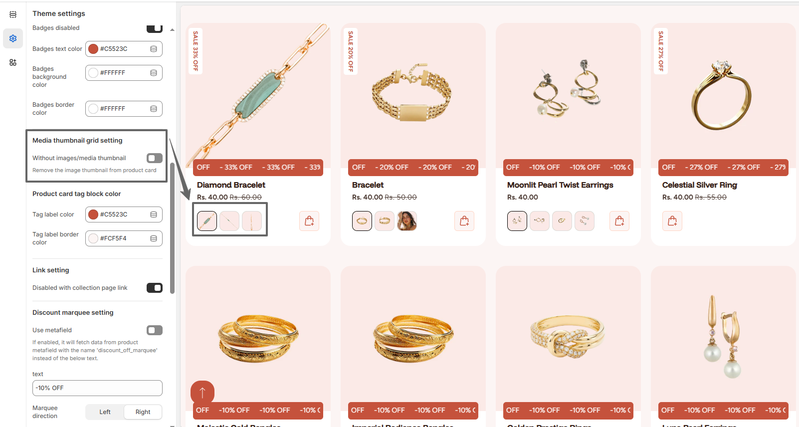
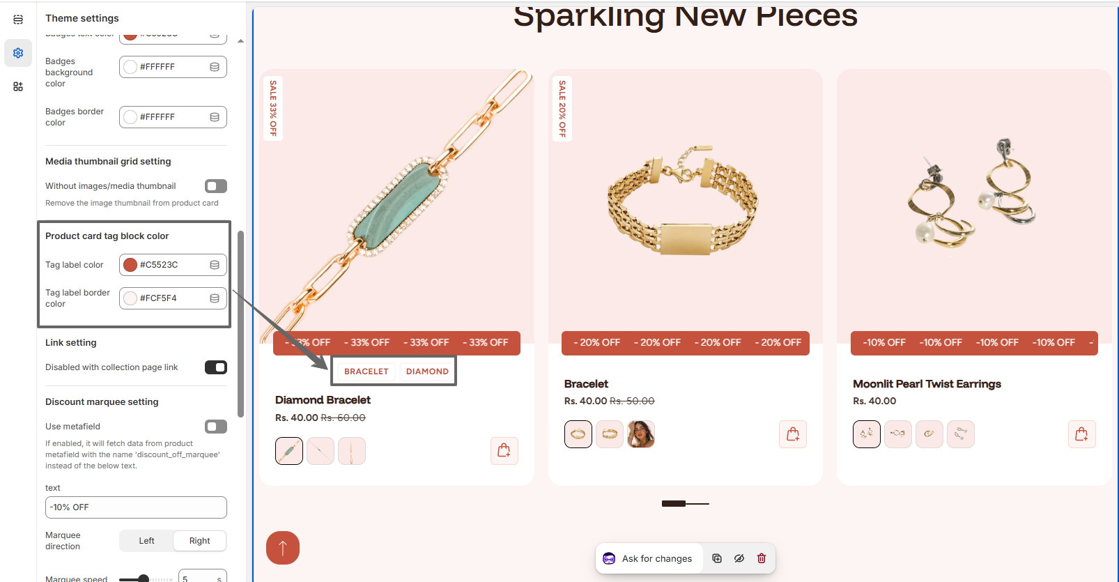
Product Card Tag Block Color
- Set Tag Label Color.
- Adjust Tag Label Border Color.
Link Setting
- Enable Collection Page Link to include the collection path in product URLs (e.g., /collections/.../products/...). This helps maintain collection context for navigation and breadcrumbs.
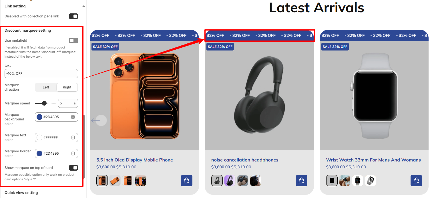
Discount Marquee Setting
The discount marquee displays scrolling promotional text on product cards to attract customer attention.
- Enable Use Metafield to fetch dynamic discount text.
- Set custom Text (e.g., "-10% OFF").
- Choose Marquee Direction (Left or Right).
- Adjust Marquee Speed.
- Set Marquee Background Color.
- Choose Marquee Text Color.
- Adjust Marquee Border Color.
-
Show marquee on top of card:
Enable it show the Discount Marquee text on top of the product card.
Note: This option only works when the Product Card Style is set to 'Style 2'.
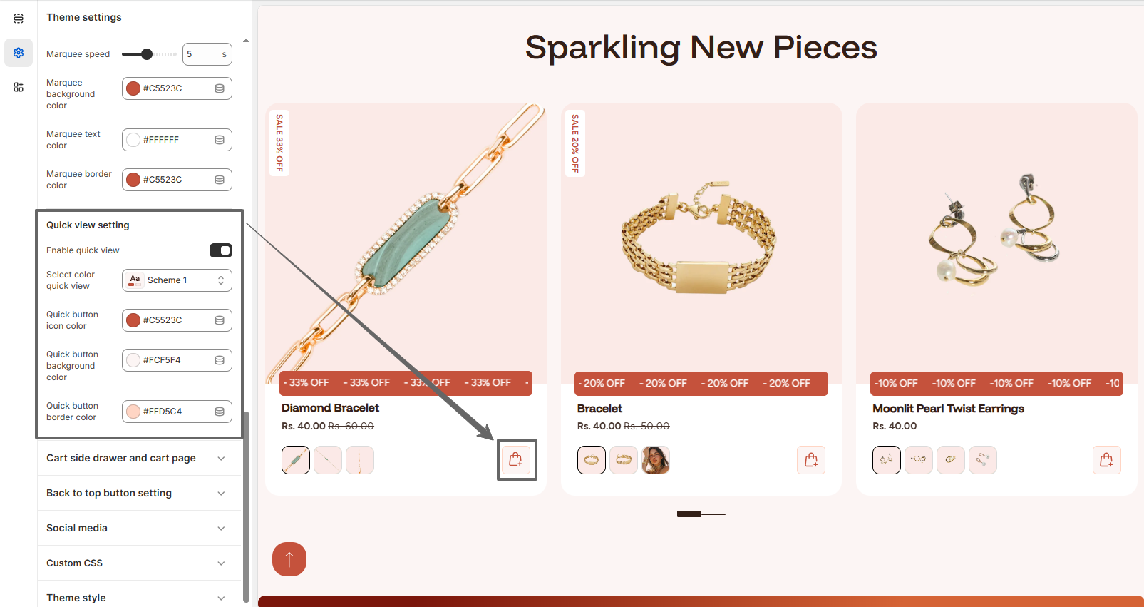
Quick View Setting
The quick view feature allows customers to preview product details without leaving the current page.
- Enable or disable Quick View.
- Select Quick View Color Scheme.
- Set Quick Button Icon Color.
- Choose Quick Button Background Color.
- Adjust Quick Button Border Color.