
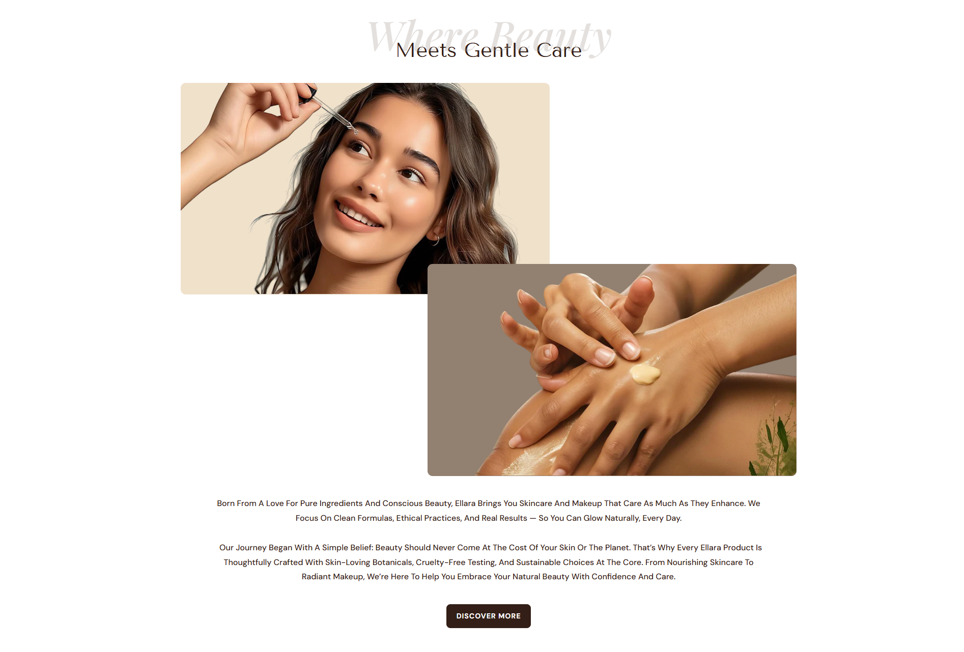
Image And Text
The Image And Text section lets you pair impactful visuals with meaningful content in a flexible, split-layout design. You can display images alongside headings, descriptions, and a call-to-action button to tell your brand story, highlight collections, or promote featured products. With customizable alignment and layout options, this section helps draw attention to key messages while maintaining a clean, balanced look across all devices.
Adding the Image And Text
- From your Shopify admin, go to Online Store ? Themes.
- Click Customize on the Dynamic theme.
- In the Theme Editor, use the drop-down selector to choose the page where you want to add or edit the Image And Text section.
- Click Add Section (or select an existing Image And Text if already added).
- Click Save to apply your changes.
How to edit an Image And Text section
To edit the image and text section in your Shopify theme, Dynamic, follow these steps
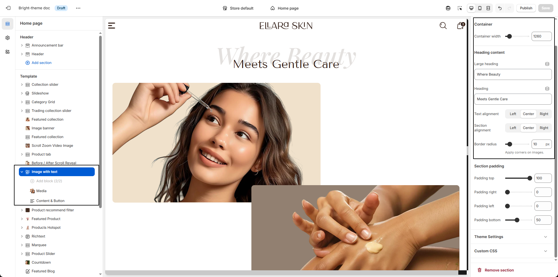
- Color Scheme: Select a color scheme (e.g., Scheme 1) to control the background, text, and accent colors of the Image And Text section.
- Container Width: Set the maximum width of the section content (e.g., 1260px) to keep the layout balanced and readable.
-
Heading Content:
- Large Heading: Add a bold introductory line.
- Heading: Enter the main heading text.
-
Text Alignment: Define how the text content is aligned within the
section.
- Left: Aligns text to the left for a clean, traditional reading layout.
- Center: Centers the text for a balanced and visually focused presentation.
- Right: Aligns text to the right for a modern and distinctive style.
- Border Radius: Adjust the corner roundness of images (e.g., 10px) for a softer, modern look.
Configure the Image And Text Block
The Image With Text section allows you to combine visuals and content in a balanced layout. This section supports two block types Media and Content & Button giving you full control over how images and text are displayed together.
-
Media Block:
- Image First Background: Set a background color behind the first image.
- Select First Image: Upload the primary image using Upload images.
- Image Second Background: Choose a background color for the second image.
- Select Second Image: Upload the secondary image to complete the visual layout.
-
Content & Button Block:
- Content: Add descriptive text such as your brand story, values, or product philosophy.
- Button Label: Enter the call-to-action text (e.g., “Discover more”).
- Button URL: Link the button to a page such as About Us.